Onboarding was a tour: a sequence of highlights pointing at the sidebar, the new-note button, the search field. It was well made, and it was the whole of the introduction, and it was teaching the wrong things.
The realisation came from writing down what a person actually needs to know in their first minute, and then noticing that a tour is structurally incapable of saying most of it.
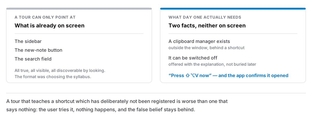
A tour can only point at what is visible
That is the constraint, and everything follows from it. A tour highlights elements on screen. So the things it can teach are exactly the things a person could have discovered by looking.
The two most important facts about this app on day one are neither of them on screen.
The clipboard manager exists. It lives outside the window, behind a keyboard shortcut. There is no button for it, no panel, nothing in the sidebar. A user who never learns the shortcut has bought an app and received two thirds of it, and no amount of pointing at the visible interface will tell them, because the feature is deliberately not in the visible interface.
It can be switched off. This matters more than a feature announcement. A tool that records everything you copy is one people are entitled to be wary of; some of them will want it off, and finding out that off is available is part of deciding to trust the thing at all. A tour has no vocabulary for "here is something you may not want, and here is how to decline it".
Every step of the old tour was accurate. The introduction as a whole was still wrong, because the syllabus was chosen by what could be highlighted rather than by what was worth knowing.
What replaced it
A welcome now runs first, and hands over to the tour afterwards, or does not, because every step can be left.
What the app is, in a sentence, before anything else. Not a feature list. The thing a person would say to a friend.
A theme, applied live. You pick, and the app changes underneath the dialog rather than showing you a picture of what it would look like. That is a small thing that pays twice: the choice is real, and the first interaction anyone has with the app is one where something they did changed something immediately.
The clipboard manager, explained, with a keep-or-skip choice. Explained meaning what it records and where that goes, before the choice, not after. And then the shortcut, with a prompt to press it now, which confirms itself when the popup actually opens.
That last detail is the part I would defend hardest. Telling someone a shortcut is not teaching it. Watching them use it once, and having the app acknowledge that it worked, is the difference between a fact they were told and a thing they have done. It also verifies the shortcut works on their machine, which is not guaranteed. Another app may already own it.
Three things worth knowing on day one, and then out.
The rule the rewrite ran into
The tour that follows is now built around anchors — new note, search, tasks, the calendar, settings — and it has one conditional behaviour that turned out to be the whole lesson.
If the clipboard manager is off, the tour's clipboard steps disappear entirely.
They used to be unconditional, which produced the worst possible outcome: a tour teaching a keyboard shortcut that had deliberately not been registered. The user presses it, nothing happens, and now they have learned something false about the app and about their own competence. That is worse than a tour that says nothing at all, because silence leaves no wrong belief behind.
Any interface that teaches has this obligation. If you tell someone how to do something, the something has to work when they try it. Which means every piece of instructional UI has a dependency on the state it describes, and that dependency is invisible in the code until someone turns the feature off.
Written at the end, not the beginning
One more small fix with a general shape.
The flag that records "this user has been introduced" was written when the introduction opened. So closing the app halfway through the welcome — which is a thing people do, because a first launch is often a quick look before making a cup of tea — meant it never appeared again. The user had been marked as introduced by having been shown the first screen of an introduction they never finished.
It is written when the welcome is finished or explicitly skipped. Skipped counts, because that is a decision; interrupted does not, because that is not.
Both halves also replay from settings, separately, so the tour is available later as what it is actually good for: a reminder for someone who has used the app for a month and wants to know what they have missed. In that role it is genuinely useful. It was only ever bad at being first.
What I would ask of any first run
- What are the two or three things that cannot be discovered by looking? Those are your syllabus. Everything visible can wait for curiosity.
- Is there anything here a reasonable person might not want? Offer the decline, early, next to the explanation rather than buried in settings.
- Does anything you teach depend on state that could be off? Then it needs to disappear when that state is off, or you are teaching a falsehood.
- Does the user do anything, or only read? One real action beats five screens.
- When is "done" recorded? If it is at the start, a person who was interrupted has silently used up their introduction.
None of this is exotic, and all of it came from the same place: writing the list of what somebody needs to know before looking at what the existing format was able to show them. The format had been choosing the content for a year, quietly, and it had chosen badly, not because a tour is bad, but because it was answering a question nobody had asked it.
The features that are deliberately absent are their own kind of introduction too — the ones I said no to, and how support works for an app that does not know who you are.