The top of this site's landing page shows the app in motion. For a while, that motion was a 710 KB animated WebP, swapped in over a small still image once it had loaded.
There were three things wrong with that, and they are worth separating because they fail differently: one is a performance measurement problem, one is an accessibility problem, and one is about people who never wanted the file at all.
The measurement problem
Largest Contentful Paint is the metric browsers use to answer "when did the main thing appear?". On a landing page, the main thing is almost always the hero image. It is the biggest element above the fold, so it is what gets timed.
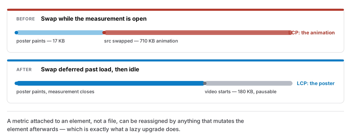
Here is the trap. The measurement does not close the instant something paints. And the swap replaced the src of the same element the browser was timing, while that window was still open.
Chrome then times whichever image the element settles on. So the score for the page was being set by the 710 KB animation, the very file the small still exists to hide until it is ready. The still weighed 17 KB and painted almost immediately, and it was getting no credit for it, because the element it painted into went on to become something forty times larger.
The fix is unglamorous: wait for the page load event, then wait for an idle moment, and only then swap. By that point LCP is decided and the poster owns it, which is the honest answer. The poster is genuinely what the visitor saw first.
What I take from that one is narrower than "optimise your hero". It is that a metric attached to an element rather than to a file can be quietly reassigned by anything that mutates the element afterwards. Progressive enhancement that swaps sources — low-quality placeholders, lazy upgrades, format negotiation done in JavaScript — is exactly the pattern that trips it.
The accessibility problem
An animated image cannot be paused. There is no control, no keyboard affordance, nothing to stop it. It loops for as long as the page is open.
That is not a preference issue. Content that moves for more than a few seconds and cannot be paused is a recognised barrier. It competes for attention with the text beside it, and for some readers that competition is not winnable by concentrating harder. A looping product demo behind a paragraph explaining what the product is makes the paragraph harder to read, which is a strange thing for a sales page to do to itself.
So it is a <video> now. Video elements can be paused, they respect the browser's own controls, and they come with the accompanying decision made explicit rather than implied.
The file also got smaller by more than half in the process: 180 KB of MP4 against 710 KB of animated WebP, for the same footage. Animated image formats are a workaround for the era before video autoplay was allowed inline, and they are still worse than video at exactly the thing they are used for.
The people who should never have downloaded it
The third problem is the one I would have missed entirely if the first two had not made me open the file.
Two groups of visitors were paying for a decoration they were never going to see the benefit of:
Anyone who has asked for reduced motion. Their operating system carries an explicit instruction that animation should be dialled down, and the site's own CSS honoured it — so the animation was downloaded, decoded, and then suppressed. The request had already cost them the bytes before anything read the preference.
Anyone on a connection flagged as metered or slow. A hero animation is the definition of optional. Sending it to a phone on a poor connection, ahead of the text that explains what the app is, gets the priorities exactly backwards.
Neither now downloads it at all. The check happens before the request rather than after, which is the entire difference between honouring a preference and pretending to.
I would generalise it like this: a media preference is not a rendering instruction, it is a fetching instruction. If you only apply it in CSS, you have kept the visual promise and broken the practical one, and the practical one is the reason the setting exists.
And a comment that had been wrong twice
One small archaeological note, because it made me laugh and then made me change a habit.
The comment above the image explained the size trade-off using two numbers: 15 KB and about 240 KB. Neither was true. They described a file that had been replaced twice since the comment was written, and each replacement had updated the code and left the explanation behind.
A stale comment about a number is worse than no comment, because it is the kind of thing you read once and cite later without re-checking. If a comment contains a measurement, it is a fact with an expiry date attached, and the fix is either to re-measure when you touch the code or to write down what you measured and when, so the next reader knows how much to trust it.
What a hero image owes the reader
Rolled together, my current rules for anything moving at the top of a page:
- It must be pausable. If it cannot be, it should not be moving.
- It must not be the largest contentful paint. Show a still, let the still be timed, and upgrade after the page has settled.
- It must not be sent to people who have opted out — reduced motion, metered connection, small screen where the layout drops it anyway. Check before the request.
- It must be smaller than you think it needs to be. 180 KB is a demo. 710 KB is a demo plus a tax on everyone who came for the sentence underneath it.
- It must not be the thing the page relies on to explain itself. The page should read perfectly with the media removed entirely, which is a good test to actually run, rather than assume.
That last one is why the same change added a single plain sentence saying what this app is, set quieter than the headline above it. Motion is good at showing that something feels quick and useless at saying what it does, and a visitor arriving with the animation blocked, the video not yet loaded, or the page read aloud to them deserves the sentence.
Related, from the app side of the same concern: why an app should open instantly, and what happened when the sidebar read every note to draw a list.