Dark mode arrived with a health claim attached, and it stuck: light text on dark is easier on your eyes, so use it at night and you will feel better.
The claim is shakier than the consensus suggests. What research there is on polarity mostly points the other way for long-form reading. Dark text on a light background tends to be read slightly faster and more accurately by people with typical vision, because a bright background contracts the pupil, which increases depth of field and sharpens what you are looking at. Light text on a dark background does the opposite, and it is why white-on-black text can look faintly bloomed or haloed, especially for anyone slightly short-sighted.
None of which means you should stop using dark mode. It means the reason to use it is not the one on the tin, and the settings that actually reduce evening eye strain are elsewhere.
What is actually tiring your eyes
Three things, in roughly this order.
Brightness mismatch with the room. A display at daytime brightness in a dark room is the single largest source of evening discomfort, and it is true in dark mode too — a "dark" interface with bright white text in a black room is still a small light in your face. Matching the screen to the ambient light does more than any colour scheme.
Not blinking. People blink dramatically less while reading a screen, which dries the eye surface and produces most of what gets called eye strain. No software setting fixes this. Looking away periodically does, which is what the twenty-twenty-twenty guidance is about: every twenty minutes, look at something about twenty feet away for twenty seconds. Unglamorous and more effective than any theme.
Contrast that is too high, or too low. Pure white on pure black is maximum contrast, and maximum is not optimal. Neither is grey-on-grey, which is the fashionable failure. Text at 40% opacity looks elegant in a screenshot and is genuinely hard to read for a lot of people, particularly over 40.
Blue light, notably, is not on this list. A Cochrane review of 17 randomised trials covering 619 people across six countries, published in 2023, concluded that blue-light filtering spectacle lenses probably make no difference to eye strain from computer use or to sleep quality, and found no evidence they protect the retina. Lenses are not a screen filter, so that does not transfer directly, but it is the strongest evidence available on the underlying claim, and it does not support treating a warm-shifted display at night as anything more than a preference.
The settings that actually help
Text size, larger than you think. The most effective anti-strain setting there is, and the one people resist because larger text feels like an admission. Bumping the editor a point or two removes more strain than any palette change, and your eyes are not the same as they were at 25.
Line height, around 1.5. Tightly-leaded body text makes your eye lose its place returning to the start of the next line, and that reacquisition is fatiguing in a way that does not announce itself.
Line length, 60 to 80 characters. Text running the full width of a 27-inch display is the most common readability mistake in software, and it is severe. Every return sweep becomes a long journey across the screen with an opportunity to land on the wrong line. If an app offers a reading width or focus mode, this is what it is for.
Screen brightness matched to the room. Adjust it when the light changes rather than once a year. If you find yourself squinting, that is the setting, not the theme.
Those four cost nothing, apply in any app, and between them do most of the available work.
When dark mode genuinely is the answer
Not never, just for different reasons than advertised.
On OLED, true black is off. A pixel displaying pure black on an OLED emits no light at all. In a dark room that is a real, visible difference and not a subtle one, and it is the strongest argument for a true-black theme rather than a dark-grey one. Note that this only holds for actual #000000. A "dark" theme using very dark grey lights every pixel.
For anything that is not long-form prose. Code, dashboards, terminals, image editing. Dark interfaces work well where you are scanning structure rather than reading paragraphs, and where a bright surround would compete with the content.
Because the room is dark. A large bright rectangle in a dark room is unpleasant regardless of the science, and reducing the lit area genuinely helps. This is a legitimate reason and probably the real one for most people.
Because you prefer it. Which is fine and needs no justification. Preference is a valid reason for a colour scheme; it just is not a health claim.
The middle options nobody uses
Light and dark are not the only two settings, and the in-between ones are often better for reading.
Sepia or cream. A warm off-white background at reduced luminance. Easier than pure white in a dim room, and it keeps dark-on-light polarity, which is where the readability advantage sits. This is what e-readers have offered for years and it remains underused on desktops.
Newsprint or paper tones. Slightly grey, slightly warm, low-glare. Good for long daytime reading on a bright display.
Reduced-contrast dark. Light grey text on dark grey rather than white on black. Keeps the dark-room benefit while removing the haloing that makes white-on-black uncomfortable.
If an app only offers light and dark, you are choosing between two extremes of a range where the useful settings are usually in the middle.
Per-document settings, briefly
Worth mentioning because almost nothing offers it and it is genuinely useful: the right typography for a page of prose is not the right typography for a code note. Prose wants a serif or a humanist sans, generous leading, a narrow measure. Code wants a monospace, tighter leading, and the full width.
Being able to set those per note rather than globally means you stop compromising between two things you do differently, the same argument as two modes for writing and code, applied to the type rather than the interface.
The honest version
If you have persistent eye strain, this is a question for an optometrist rather than a settings panel. Uncorrected astigmatism and an out-of-date prescription produce exactly the symptoms people attribute to their screens, and no theme fixes either.
For ordinary evening discomfort: turn the brightness down, make the text bigger, narrow the column, and pick whatever colours you like. That is genuinely the order of importance, and the colour scheme comes last.
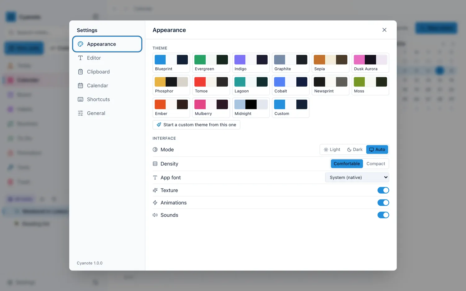
Cyanote ships fifteen themes, each with a full light and dark palette checked for contrast, including Newsprint and Sepia for the middle ground, and Midnight in true black for OLED. Or you can set the seven colours the whole app is drawn from and build your own. Typeface, size and line spacing are settable for the editor and for the app around it, globally or per note, and ⌘\ (Ctrl+\ on Windows) hides the sidebar when you want the column and nothing else.