You will look at your notes app more than you look at most people you know. A few hours a day, for years, at the same handful of pixels. It is a strange thing to leave entirely at the factory setting, and a stranger thing to spend a Sunday on.
Both mistakes are common. This is about telling them apart.
Most customisation is procrastination
Let me get this out of the way, because a page selling a customisable app has an obvious incentive not to.
Choosing a theme feels like work. It produces visible change, it is pleasant, it is reversible, and at the end of it you have written nothing. It belongs to the same family as reorganising your folders, an activity that borrows the feeling of getting your house in order without any of the effect, and I have written about that particular trap already.
If you are deciding between two accent colours, the honest answer is that neither will affect your life and you should pick the one you like and close the settings window.
Four settings that are not decoration
The exception is narrow, and it is about reading rather than looking.
Type size. Most software ships at a size chosen for a screenshot rather than for your desk. If you have ever enlarged the text on your phone, you have already decided this matters, and the same reasoning applies to the app you read for hours.
Line spacing. This is the one people never touch and feel immediately. Text set too tight is harder to come back to. Your eye loses its place returning to the start of each line, which is why the effect shows up most on the notes you re-read rather than the ones you write once.
Line length. The third is not a font setting at all: it is how wide the text is allowed to run. A note stretched across a 27-inch monitor is a genuinely difficult read, and the fix is a narrower column rather than a bigger font.
Contrast. Not "dark mode versus light mode" but the actual distance between the text and the page behind it. Too little and you squint at midday. Too much, on a black background at night, and the letters glare and smear at the edges.
Get those four right and you will read your own notes more. That is the whole return, and it is bigger than it sounds. Most notes systems fail at the reading end, not the writing end.
A theme is two palettes, not one
Here is the part that is genuinely harder than it looks, and where a lot of custom themes fall over.
Your Mac switches between light and dark on its own, at sunset or on a schedule, and a theme that has only been checked in one of them will be unreadable in the other about twelve hours from when you built it. Grey-on-grey that is elegant at 2pm becomes invisible at 11pm.
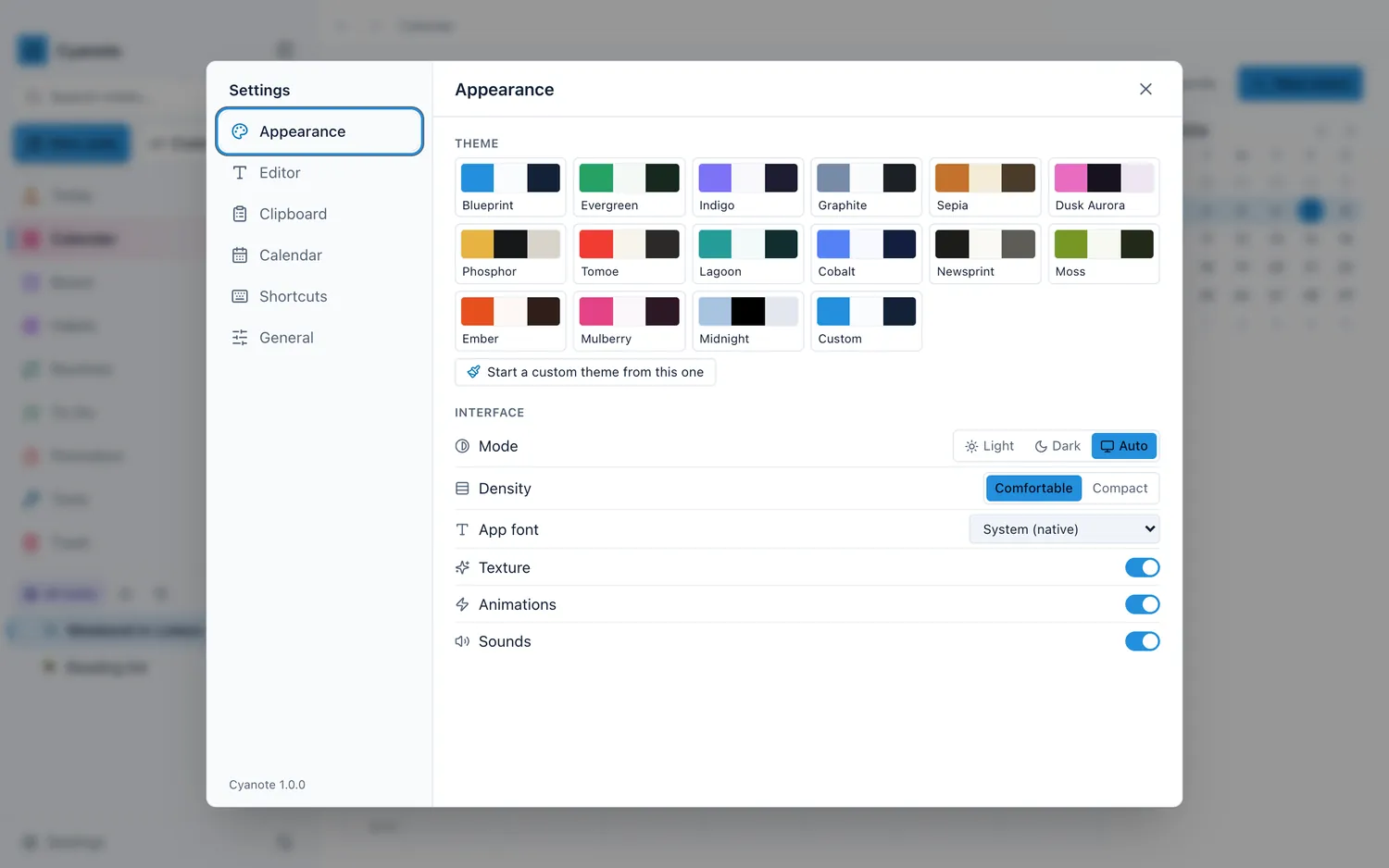
So a theme worth shipping is two full palettes that have both been checked for contrast, not one palette with the brightness inverted. Cyanote has fifteen of them on that basis. A few are there for specific conditions rather than for taste:
- Newsprint — broadsheet paper and pure black ink. The highest-contrast light theme, for a bright room or a screen you are fighting with.
- Sepia — warm, low-contrast reading paper. The opposite errand: easiest on the eyes in a dim room, and the one to reach for when you are reading rather than typing.
- Phosphor — amber on warm carbon. A terminal throwback that turns out to be a genuinely good theme for looking at code.
- Midnight — true black, for OLED screens. On a Mac the point is not battery, it is that a black page in a dark room stops the whole window acting as a lamp.
The rest are ordinary and that is fine. Ordinary is what you want for eight hours.
Per-note settings, which is the actual argument
Global settings assume everything you write is the same kind of thing. It is not.
A journal entry you will re-read wants a serif, generous line spacing and a narrow column. A meeting note you will scan for one decision wants tighter spacing and a size you can take in at a glance. A snippet wants monospace and nothing else, because in code the shape of the characters carries meaning: a zero has to be distinguishable from an O, and a serif will not help you find a missing bracket.
So in Cyanote the body, heading and code typefaces are set separately, the size and line spacing with them, and the column width per note — globally or on a single note. The per-note version is the one that earns its keep, because it means the format can follow the material instead of the material being flattened to fit one setting.
It also does something quieter: it makes the kind of note visible before you have read a word of it. Open something set in monospace and you already know what you are looking at. That is worth more than any colour scheme, and it is most of why writing and code end up wanting different treatment in the same app.
Building your own, and the way it goes wrong
If none of the fifteen fits, the whole app is drawn from seven colours and you can set all seven. That is enough to build something genuinely your own.
It is also enough to build something you cannot read, and the failure is not obvious on the day you build it. Two mistakes account for nearly all of it:
Contrast that only works in one mode. You will pick your colours in the light and discover the result at night, when your accent colour has become a dark smear on a dark background.
Contrast that only works on your screen. A palette tuned on a bright display in a bright room can be unusable on the same laptop outdoors, or on an external monitor with different colour handling.
The shipped themes have been checked in both palettes. A theme you build has been checked by you, on one screen, on one afternoon. That is not an argument against building one. It is an argument for living with it for a week before deciding it is finished.
When the defaults are the right answer
If you are undecided, use the default. It was chosen by someone who had to make it work for everybody, which is a decent proxy for making it work for you.
Change the size if the text is too small. Change the line spacing if you lose your place. Change the theme if the room is dark. Those are responses to an actual complaint, and a setting changed in response to a complaint almost always sticks. A setting changed out of curiosity almost always gets changed again next month.
The point of customisation is not self-expression in an app only you will see. It is that the software should stop being noticeable, so that what you wrote is the thing in front of you.
Cyanote does this the way it does everything else: locally, in a database on your own disk, with no account, for $7.99 once. The settings live with your notes, which means they survive a restore and do not follow you to a second machine, because there is no sync, which is a real limitation and not a philosophical position.