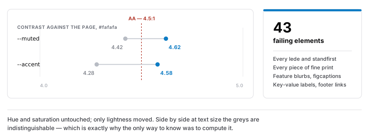
An accessibility audit of this website came back with forty-three failing elements. Every .lede, every piece of fine print, every feature blurb, figcaption, key-value label and footer link.
Forty-three problems is a project. It is a week, a spreadsheet, an argument about whether the design survives.
It was two numbers.
The tenth of a ratio nobody can see
Every colour on this site is a token, and two of them were short:
| Token | On the page background | AA needs |
|---|---|---|
--muted | 4.42:1 | 4.5:1 |
--accent | 4.28:1 | 4.5:1 |
That is the entire finding. Two values, each a rounding error below the line, feeding forty-three places.
Both are now three shades darker — hue and saturation untouched, only lightness moved — and clear at 4.62 and 4.58. The accent measures 4.78 on the white panels it also sits on. Side by side with the originals, at text size, I cannot tell them apart, and I knew which was which.
That is worth sitting with rather than treating as a happy ending. The failing greys did not look broken. There was no stage at which the design felt wrong and I overruled it. They were 0.08 short on a scale nobody perceives in units, and the only way to know was to compute it.
Measure against your actual background
The rule I would pass on: check a colour against the background it will really sit on, not against white.
This page is #fafafa. Not white, but an off-white, chosen because a full-white page under a lamp at night is a light source rather than a page. The gap between #fafafa and #ffffff is small enough to be invisible and large enough to hide exactly the failure I had: a grey that clears 4.5:1 on pure white and lands at 4.42 on paper.
Nearly every contrast tool defaults to white. If your page is not white, its default answer is optimistic, and optimistic by roughly the size of the mistakes you are trying to catch.
The other two findings, which were not colour
The same audit turned up two things that had nothing to do with contrast, and both were structural.
The footer's column headings were h4 sitting immediately after the closing section's h2. Visually fine, because the footer's own CSS sets their size regardless of level, which is precisely why nobody noticed. To a screen reader moving through headings, a skipped level reads as a missing section: the listener is told something exists between these two things and is not shown it. They are h3 now, in the hand-written pages and both generators. The level was always free to be correct; nothing about the design depended on it being wrong.
And one link inside a paragraph of muted text was distinguished from the text around it by hue alone, at a ratio of 1.03:1 against its neighbours. Not "hard to see" but invisible, to anyone whose colour vision does not separate those two greys, and near enough invisible to everyone else. Every other link in running text on this site is underlined. This one had been made an exception at some point, for tidiness. It is underlined now.
Both of those are the same category of bug: something that looks right because the visual layer was doing the work, while the layer that carries meaning to a machine or a screen reader said something else.
The accessibility score went from 89 to 100 on mobile and desktop. Performance, best practices and SEO did not move — 97/100/100 on mobile, 100/100/100 on desktop — which is worth saying because the usual objection to this work is that it costs something elsewhere. It cost three shades of grey.
In the app, the colours come from the user
The website is the easy half. Every colour there is one I chose. The app paints text and icons on colours that arrive from data: a habit's swatch, a routine's time of day, a priority on the board, and the accent the user picked out of a palette. You cannot check those by eye at design time, because at design time you do not know what they are.
For a long time the app simply wrote white on all of them. Measured, that fails badly. White on the lime habit swatch #84cc16 is 1.98:1. Near-black on the same swatch is 11.1:1. Not a close call in either direction. The wrong choice by a factor of five.
The accent had a heuristic, which was worse than none, because a heuristic looks like diligence. It used Rec. 601 perceived brightness with a 0.6 cutoff to decide between light and dark text. That is a formula for a different problem — it comes from video luma, not from contrast — and against the thirteen built-in accents it chose wrong for ten of them.
There is now one implementation of one formula, WCAG relative luminance, and every caller uses it the same way: compute the ratio for both candidate foregrounds and take whichever actually scores higher.
Picking the better of two beats any threshold, and it fails gracefully. On a saturated mid indigo where neither black nor white clears 4.5:1, a threshold has to invent an answer; comparing gives you the less bad one and no drama.
The half-shade that unlocked the palette
One detail from that work I still like.
The dark foreground is now pure black, where it used to be a near-black #141419, a softening that had been introduced because pure black felt harsh in the abstract. On a saturated fill at chip size, at the sizes text actually appears, nobody can see the difference. What it cost was about 0.6 of a contrast ratio.
And 0.6 was the whole problem. Two habit colours could not be made readable with either foreground: indigo #6366f1 capped at 4.47 and violet #8b5cf6 at 4.34. Against pure black they reach 4.70 and 4.96. The palette needed no editing at all. The two colours I had been ready to remove were fine, and the thing standing between them and passing was an unmeasured aesthetic preference in the foreground. Everything else gained too: lime from 9.29 to 10.63, amber from 8.55 to 9.78.
There is a companion trick for the light themes. Some code has to darken a colour during render, before it can read the live background, so it measures against the darkest background any light theme uses: the warm paper of the sepia theme. Clear it there and you clear it on every lighter one, which is all fifteen. One conservative reference instead of fifteen conditional cases.
Why I think this is the good kind of accessibility work
There is a version of this that is compliance theatre: a score to raise, a report to file, a design flattened into beige.
None of what is above changed a design decision. The greys are the same greys. The accent is the same blue. The habit palette kept every colour, including the two that were about to be cut. The whole delta is that the values were computed instead of eyeballed, and computing them was cheaper than the meeting about whether they looked fine.
Contrast is one of the few parts of design that is arithmetic. It has a formula, the formula is published, and your opinion is not an input. That makes it the part you should never be guessing at, and, unusually for accessibility work, it means you can be certain you are done rather than hopeful.
If you would rather read the reading-comfort side of the same subject, there is a post about setting a page you will actually read at night, and one about making an app fit your own eyes.